|
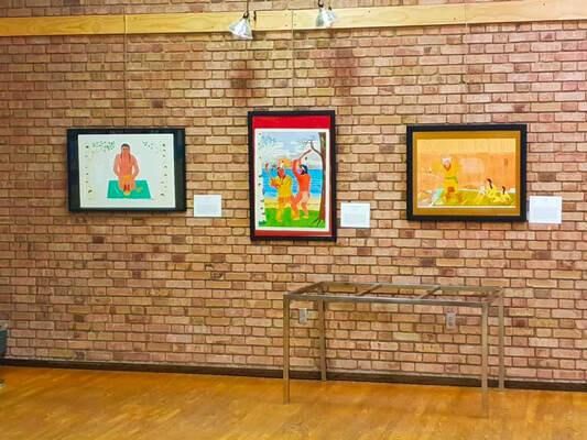
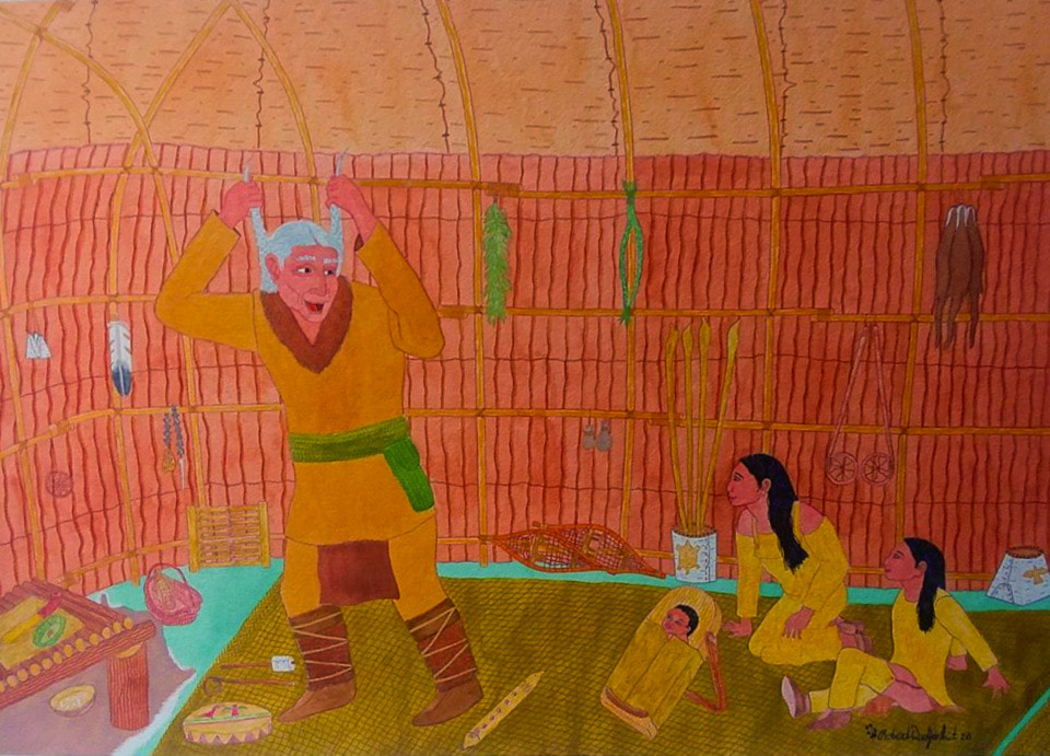
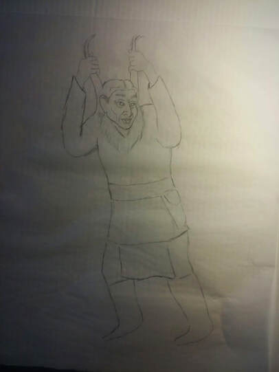
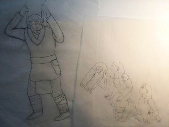
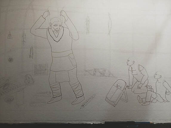
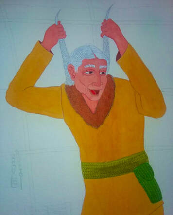
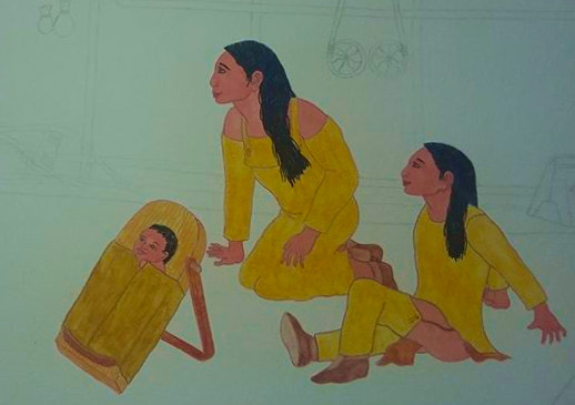
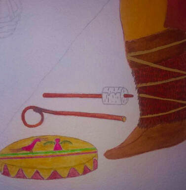
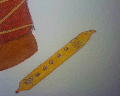
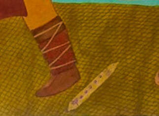
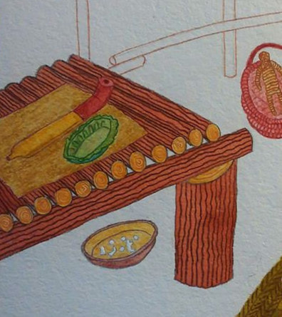
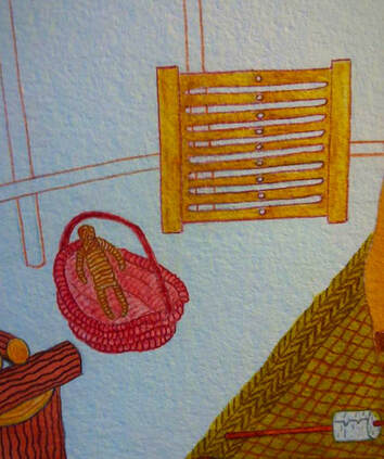
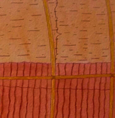
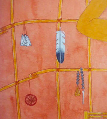
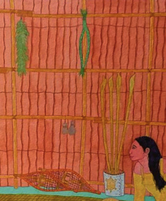
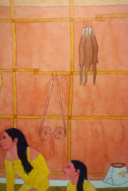
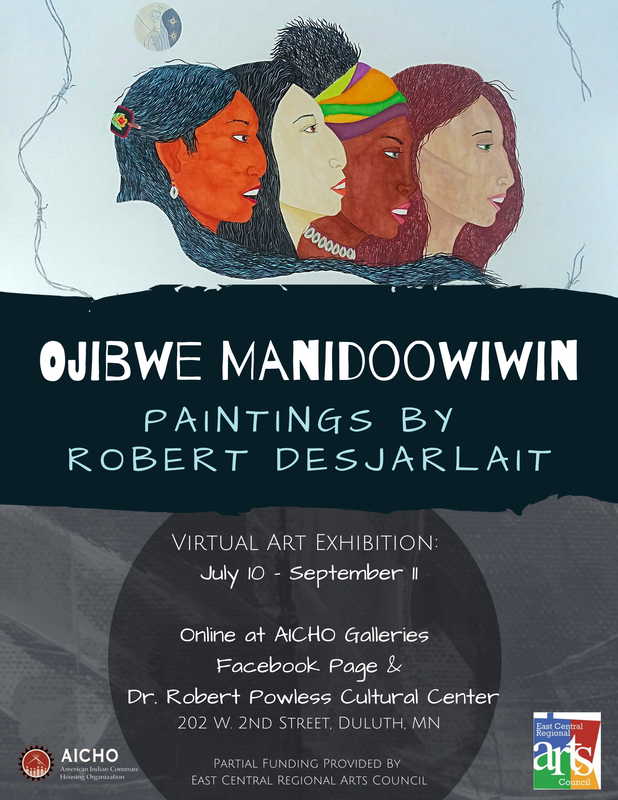
In conjunction with my current solo exhibition (“Ojibwe Manidoowiwin,” AICHO Gallery, July 11-Sept 10), I’ll be writing a few articles related to the art. This first article focuses on the process of making art – some of my concepts regarding my art and looking at one of my works - from initial sketches to the finished work. Concepts and Visions I’ve written elsewhere about the meaning of Ojibwe Manidoowiwin. Ojibwe Spirit, i.e., Ojibwe Manidoowiwin, is based on Jung’s concept of the collective unconscious (kollektives Unbewusstes). Jung wrote: “And the essential thing, psychologically, is that in dreams, fantasies, and other exceptional states of mind the most far-fetched mythological motifs and symbols can appear autochthonously at any time, often, apparently, as the result of particular influences, traditions, and excitations working on the individual, but more often without any sign of them. These "primordial images" or "archetypes," as I have called them, belong to the basic stock of the unconscious psyche and cannot be explained as personal acquisitions. Together they make up that psychic stratum which has been called the collective unconscious. “The existence of the collective unconscious means that individual consciousness is anything but a tabula rasa and is not immune to predetermining influences. On the contrary, it is in the highest degree influenced by inherited presuppositions, quite apart from the unavoidable influences exerted upon it by the environment. The collective unconscious comprises in itself the psychic life of our ancestors right back to the earliest beginnings. It is the matrix of all conscious psychic occurrences, and hence it exerts an influence that compromises the freedom of consciousness in the highest degree, since it is continually striving to lead all conscious processes back into the old paths.” Ojibwe Manidoowiwin is, essentially, the Ojibwe collective unconscious. In terms of art, imagery is formed by tribal primordial images or archetypes. My art is but one aspect of Ojibwe Manidoowiwin. Visual arts, beadwork, quillwork, sculpting, carving and other art expressions are facets of Ojibwe Manidoowiwin. On another note, I can’t speak for all mazinibiigewininiwag (artists), however I think that most mazinibiigewininiwag, in particular those who have been doing art for a number of years, develop philosophies/concepts about what their art is about. It is the concept that sustains the artist in the creation of their art. The subject matter may vary, but there is a unifying concept that brings the imagery together. Art incorporates an artist’s concept of their art – what it’s about; the process expresses the concept through the painted imagery. However, an artist doesn’t sit before a canvas and consciously think about how s/he is going to express their concept. Rather, the concept is inherent within the artist and the art expresses an innate spontaneity of concept. But the concept isn’t necessarily static. Spontaneity allows for changes. Hence, the concept evolves yet remains rooted in the central core of the artist’s intuitive notion of her/his creativity. Another level of creating art is izhinamowin – vision. It may be a complete vision –Waaseyaabindamowin – in which the imagery is perspicuous when the artist begins his/her work. Or, it may be bawewin(an) – imagery revealed in a dream or several dreams. Sometimes it’s a combination of the two. The vision may be complete, yet bits and pieces may be revealed through dreams and waking visions as the artist creates her/his work. This is part of the spontaneity of concept. Essentially, a visual work is the fulfillment of the artist’s vision. Titles in Ojibwe When I first began doing my art, a number of pieces were titled in Ojibwe. Out of the 31 works in my first solo exhibit (1986), 16 were titled in Ojibwe. At that time, I knew very little about the language. What was the impetus for using Ojibwe titles? I wasn’t influenced by other Ojibwe artists. As far as I knew, other artists weren’t using Ojibwemowin. In the 1980s, language was stagnant. There weren’t any language programs. The Baraga dictionary and Nichols and Nyholm Word List book were the only sources for Ojibwe words. Albeit the language earning was limited, I had access to words. Using words for titles wasn’t simply because I wanted my art to be more “Ojibwe.” It had to do with the changes I was going through in my life. In 1982, I stopped drinking. Sobriety opened the door to engage in art. My sobriety marked a new life. It allowed me the opportunity to learn about traditional values and practices. The words, terms, and phrases of language enabled me to see the world through an Anishinaabe mindset. Ojibwemowin helped to give my world shape and form. It gave, and continues to give, shape and form to my art. N. Scott Momaday wrote: “A word has power in and of itself. It comes from nothing into sound and meaning; it gives origin to all things…We perceive existence by means of words and names. To this or that vague, potential thing I will give a name, and it will exist thereafter, and its existence will be clearly perceived. The name enables me to see it. I can call it by its name, and I can see it for what it is.” To name something in one’s language gives the word power. Words are medicine. Words can hurt or they can help. Words can heal. Every word has a spiritual meaning behind it. It is the spirit of the word where the power comes from. Each word is a spiritual instruction to Gichi-Manidoo, the Creator. Each word or phrase is a prayer and a request. When we say the word or in our thoughts, we are making a request. Gichi-Manidoo responds. We need to be aware of what we are asking for and to understand the relationship between the word and the spiritual instruction behind it. In relation to art, naming a work in Ojibwe gives it power. It gives origin to the images that I paint. It also provides an educational value. The viewer learns something about the language. In this regard, it keeps the language alive. Ma’iingan signature One of the distinguishing features in my art is my signature. I sign my name with the image of a ma’iingan (wolf) paw. I’ve always signed my work with a ma’iingan paw going back to my first artwork in 1983. I quit drinking in 1982. During that time, I had several lucid dreams. A recurrent dream was about a ma’iingan. It always seemed that the ma’iingan was trying to tell me something. But the meaning only became clear after several dreams. At first, the ma’iingan was alone. He wandered through the woods, curious and looking, observing the life around him – the plants, trees, waters, animals, and insects. He could have very well been the ma’iingan that journeyed with Anishinaaba – Original Man – companions who were separated by Gichi Manidoo to live their own lives when the Earth was new. In the dreams, he found a new companion, a female ma’iingan, with whom he fathered four cubs. Together, they lived in the forest and he became their protector. I related the dreams to my own life. Like ma’iingan, I journeyed alone. Then I met my companion. We didn’t have children during the time I had the dreams. But the dreams foretold that we would have four children. And in my role as a father, I would, like the dream ma’iingan, be the protector of my family. The ma’iingan is akin to a bawaagan (guardian spirit animal). In my new life as a young husband and a father-to-be in the near future, the ma’iingan bawaagan provided me with a sense of direction and guidance. And, it is for this reason, why I sign my name with the paw of a ma’iingan. Aadizookewinini (Storyteller) Aadizookewinini (Storyteller), 22" x 30," Watercolor/Gouache, 2020 This is my first sketch of the storyteller. I always sketch on tracing paper. Tracing paper allows me to flip the paper and see if the proportions are correct and make corrections (on both sides of the paper) if needed. Basically, the original sketch is reworked and becomes the final sketch. Details such as hair, fur, belt, pouch, etc. are added once I begin to paint the figure. I did the sketch of the children's group on a separate sheet of tracing paper to allow for positioning. At this point, I've moved from tracing paper to the medium for the painting - a 30" x 22" cold press, watercolor sheet of 300 lbs paper. I moved the dikinaagan (cradle board) to the front of the two children. I sketched in several of the items that are inside the wiigiwam. One of the things I wanted to emphasize in this painting was the inside of a wiigiwam (birch bark lodge).They were built to accommodate the size of the family. As such, they could be fairly spacious and allowed for items to be stored on the walls and the perimeter of the walls. Although it's nor depicted, a hearth is located at the center of the lodge. The first image I paint is the storyteller. The central figure is always first when I paint. I mix my skin tone and paint his face and hands. For consistency, I cover and save the skin tone paint for the children. After painting in the skin tone, I work my way down beginning with the hair, then fur collar, shirt, leggings, and apron, biboon-makizin (winter boots); the last thing I paint is the waasechiganaatig (sash) and biindaagan (pouch) that are made from reeds. After finishing the storyteller, I paint the group of children. I do all the skin tones first. Then I do the young boy, followed by the girl. The baby and cradle board is last. To complete the storyteller, I painted the items he uses to tell his stories. This detail shows his dewe'igan (hand drum), deyewe'iged (drum stick), and zhina'oojigan (rattle). Detail of storyteller's bibigwan (flute). To complete the central figures (storyteller and children), I paint the gaasiizideshimowin (floor mat). The next step is painting the desa'on (lodge platform), followed by the opwaagan (pipe), mishiikewi-dashwaa (turtle shell), and bagesewinaagan (dish game). Detail of oziisigobimizhii-makak (willow basket), asigobaani-mazinichigan (basswood bark doll), and okaadeniganaatig (loom - this particular loom is an Ojibwe heddle loom used to weave sections for reed mats) My next step is to paint the interior of the wiigiwam - abanzhiiwaatigoon (lodge poles), wiigwaasabakwaan (birch bark roof) and aasamaatigoon (inside walls). Detail - asabikeshiinh (dream catcher), bigiiwizigan (maple sugar taffy/candy), nabaa'waaganag (ring and toss game), giniw-miigwan (golden eagle feather). Detail - aagimaakwan (snow shoes), gamaagiwebiinigewin (snow snake game), wiingashk (sweetgrass), mashkodedewashk (sage). Detail - baaga'adowaanan (lacrosse sticks), nigigwayaanag (otter hides), and makak (birch bark container). Art and Text © 2020, Robert DesJarlait
2 Comments
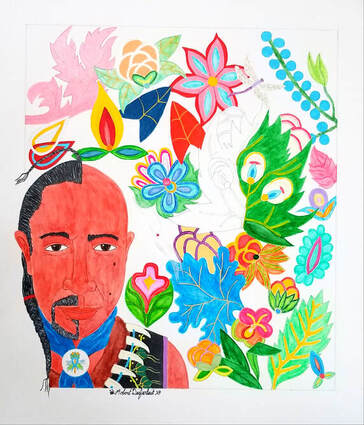
July 8, 2020 Contact: Ivy Vainio American Indian Community Housing Organization (AICHO) 218-722-7225 | [email protected] Artist: Robert DesJarlait 218-380-8491 [email protected] AICHO Galleries to Host Virtual Art Exhibition with Red Lake Nation Artist Robert DesJarlait Robert DesJarlait, Red Lake Nation Ojibwe tribal member and long time established artist, will show a collection of his recent watercolor/mixed media paintings along with a series of retrospective work from the 1980s in a virtual exhibition entitled, “Ojibwe Manidoowiwin” from July 10 - September 11. His works will be displayed in the Dr. Robert Powless Cultural Center Gallery. However, his work will be showcased online on the AICHO Galleries Facebook event page under the same name as the Exhibition for greater access for the public to view. There will also be an online recorded Artist Talk, date and time to be announced. A majority of his work is for sale. Artist’s Statement: As an artist, I paint what gives meaning to me as an individual. I look at my art from a tribal perspective. Through my art, I visualize a particular facet of Ojibwe experience. My paintings are personal visions of a tribal past. The imagery composes a micro/macro-scopic Ojibwe universe. Interwoven in this universe are creation stories, history, customs and traditions, and my central theme – Ojibwe Manidoowiwin, the tribal spirit of the Ojibwe people. Artist Bio: Robert DesJarlait (Endaso-Giizhik) is from Miskwaagamiiwi-zaaga’igan (Red Lake). He belongs to Makwa Doodem (Bear Clan). He is an artist, writer, and traditional dancer. He began his career as a fine artist in 1983. He is also an illustrator and muralist. He currently lives in Onamia, MN with his wife and daughter. To view his artwork from last year’s exhibition at the Two Rivers Gallery in Minneapols: http://thecirclenews.org/the-arts/ojibwe-artist-robert-desjarlait-reemerges-as-artistic-force/ Recognition to the McKnight Foundation, the Bush Foundation and the East Central Regioinal Arts Council for funding towards this art exhibition. Robert is willing to speak to the media about his work and this show. See contact details at the beginning of the media release. Wiizhaandige Gitigaan (Unfinished Garden) / Self-Portrait, 2019 Note: Article originally published on IHadCancer, August 2019 By Robert DesJarlait One day, the Earth was submerged by a destructive flood sent by Mishibijiw, the Great Underwater Serpent. Nenabozho, our Great Uncle, survived. Drifting on a log, he obtained pebbles of dirt from the muskrat. After planting the dirt on his log, the Earth regrew and new life reemerged from the life that existed before.” In April 2013, I heard the three words that you don’t want to hear – you have cancer. I thought my life was over. I was 66 years old, retired, and at that point in my life, art was far from my mind. One day, I took a walk in the halls of the cancer ward with my IV stand rolling beside me. My prognosis was good. Following surgery for the removal of my ascending colon, my cancer was classified as Stage I meaning the cancer hadn’t metastasized and chemo wasn’t required. As I walked along the hallways of the cancer ward, I saw walls covered in art. I had no idea who the artists were. I asked a nurse: “Who are the artists?” She replied that some of them were by former cancer patients and others were from families who had lost a loved one to the disease. And, therein, a seed was sown and a promise made that someday I would return with a painting to join the walls of art in the cancer ward. But any aspirations of returning to art came to a jolting halt in May 2016. My annual CT scan revealed a lesion on the left lobe of my liver. This time around, my surgery was preceded by four rounds of neoadjuvant chemo and followed by twelve rounds of adjuvant chemo. As a result of my recurrence, I became a Stage IV cancer survivor. In November 2018, Reemergence became a part of my cancer journey. Cancer survivors live a cautiously optimistic life. We really can’t look too far into the future. Goals and priorities need to be in the short term. The ideas that floated through my mind in the cancer ward came to fruition. But it was really a question of whether I could return, or more specifically reemerge, to the fine art form I established in the 1980s. “Gidagaabinesh” (Spotted Bird) was the first work and a tribute to Herb Sam, one of my spiritual mentors and advisors who passed from liver cancer in September 2018. I didn’t have watercolors or brushes, so I decided to use colored pencils and, for the first time, watercolor pencils. I decided to do the work encompassed in a circle – the circle was a hallmark of my illustration art in the 1990s and early 2000s. “Gidagaabinesh” was a test of sorts. Did I retain my skills as a fine artist after a nearly 35 year absence? Or had my abilities diminished? With the finished work, I found that my palette hadn’t lessened and my aesthetics had matured. Indeed, rather than being diminished, they had improved. It was almost as if they had been in limbo and waited for the reopening of the channels to my creativity. I did a sister piece - “Aazha miinawaa Manidoo-Giizhikens” (Aazha and the Spirit Tree) with two main characters from a children’s book I’m writing about two Ojibwe children with childhood cancers. Manidoo-Giizhikens (the Spirit Tree) has a special place in my heart following a photo shoot there in 2016 with well-known photographer Ivy Vainio. After completing the two works, I decided to create a body of work called Reemergence. From late November to late January, I worked on a number of pencil studies that would form the series. The art largely reflected the themes I developed in the 1980s – scenes of the traditional, everyday roles of Ojibwe-Anishinaabe women and men in the 1700s-1800s. In mid-March, I obtained watercolors, gouache (a new medium for me), and brushes, and began working on the paintings. By mid-June, I completed 15 paintings for a total of 17 works for the Reemergence series. The title reflects my reemergence as a fine artist. But it also reflects my reemergence after battling cancer for seven years. Reemergence is not cancer art per se; rather, it’s art by a cancer survivor who is Ojibwe-Anishinaabe who is an artist. The art is a paradigm of creativity and healing in a time of sickness. However, Reemergence has a deeper meaning. In a cultural context, Nenabozho’s story has a metaphorical meaning in relation to my cancer experience. Cancer and Mishibijiw are interrelated as malevolent beings that bring death, chaos, and destruction. The log is my physical body and Nenabozho represents my spirit. The pebbles of dirt are the medicines that help heal me. And, forthwith, a new life reemerges from the life that existed before. Our elders teach that our personal lives move in a circle. We always come back to a point that we’ve left behind. We may bypass the point and move on. Or we may stop at the point and find something that provides a deeper meaning and direction on our path. With Reemergence, I’ve reached such a point. © Robert DesJarlait, 2019
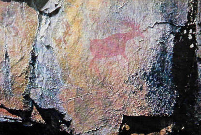
By Robert DesJarlait It would be simple to say that the Anishinaabe place in contemporary visual art began with Patrick DesJarlait and George Morrison and everything fell into place after that. But the history of Anishinaabe art is much more complex than a simplification. Placing Anishinaabe art within a specific period, e.g., contemporary, overlooks the evolution and history of Anishinaabe art. The ethnocentric perspective of Native America art history establishes labels and categories – applied art, handicrafts, decorative arts, fine art, and visual art. But from a Native American worldview, there are no borders or boundaries. Melville Herskovits writes: “Our [Western] fixation on pseudo-realism contained a hidden, culture-bound judgment wherein the values of our own society, based on our particular perceptual modes, were extended into universals and applied to art in general…The ‘natural’ world is natural because we define it as such because most of us, immersed in our own culture, have never experienced any other definition of reality.”[1] Herskovits was writing about the Euro-American perspective regarding “primitive art.” The notion of early Native art as being primitive, at least according to European standards, was established by anthropologists. Native art was considered crude and childlike. As such, it lacked aesthetic value and was purely a functional and utilitarian art. Hence, the boundary was set between Native American, African, and Oceanic indigenous art and the aesthetics of European art. Wolfgang Haberland further defines the differentiation of aesthetics: “There are several kinds of aesthetics…‘Universal aesthetics’ embraces the general human ability to create and appreciate objects of beauty. ‘Group aesthetics’ embodies a given culture’s ideas about beauty. It is shared by all or most members of the group…‘Individual’ aesthetics refers to the individual ability to appreciate, or, in the case of an artist, to create beauty.”[2] Haberland adds: “Anthropologists, art historians, and art critics interested in non-Western art are always trying to explain foreign group aesthetics through European-formed views of individual aesthetics.”[3] And therein lays the crux of the problem of defining Native art. Compartmentalized, categorized, and labeled, the interconnectedness of Native art and its inherent aesthetics are disconnected. In the ethnocentric perspective, artist and art become maker and object. The finger strokes on a rock are not connected to a paint brush on canvas. To understand Anishinaabe art, one needs to set aside labels, such as “contemporary,” and view Anishinaabe aesthetics from an Anishinaabe worldview. In this worldview, there is no separation between art forms; rather there is a continuity of aesthetics, although the medium differentiates the application and expression of those aesthetics. It should be noted that Anishinaabe art is representative of the art forms and aesthetics that evolved among indigenous peoples in North America. In this regard, Anishinaabe art is a microcosm of the macrocosm of Native American art. In Minnesota, the oldest forms of the Anishinaabeg art are found on rock faces in the Boundary Waters Canoe Area and Lake Superior National Forest and extend into Quetico Provincial Park in Canada. Dating ranges from 1000-1500 AD. Pictographs are defined as images painted or etched on rock. However, Anishinaabe writer Gerald Vizenor provides a more expressive, worldview definition – pictomyth: the believable Anishinaabe pictures of myths or believable Anishinaabe myths of pictures.[4] Vizenor’s definition correlates to A. Irving Hallowell’s study of Anishinaabe people and “other than human persons” and the relationship to stories: “Ojibwa myths are considered to be true stories, not fiction.”[5] In this view, pictomyths are the representation of the imagery of dreams and visions that formed the basis of origin stories. Pictomyths are true in the sense they are not fanciful representations of tribal myths; rather, they represent the reality and experiences of the artist in the real world. The individual aesthetics of painted rock imagery was more focused on content than form. But the forms were interrelated to a group aesthetics as evidenced by the pictomyths etched on birch bark scrolls. The differentiation between the two was media, medium, and technique. The rock pictomyths were painted with red ochres composed of iron-stained earths. According to Northern Anishinaabe artist Norval Morrisseau, the red earths used for paint resulted from a battle between two thunderbirds. The blood from the battle rained upon the earth turning the sands red. This particular sand was, in the Anishinabe language, called onaman.[6] The binding agent for onaman was fish glues or egg fluid, or bear grease. Although brushes with moose hair bristles were employed, many pictomyths were painted by finger. Selwyn Dewdney writes: “[T]he artist’s preference [was] for a vertical rock face close to the water. The sites themselves show a bewildering variety of locations…there are groups of obviously related material that form compact, well-designed compositions…[and] instances where the natural flaws of the surface are incorporated into the whole concept.”[7] Dewdney categorized pictomyths into several groups: animal, birds, mythological creatures, hands, other human subject matter, man-made objects, and, the largest group, unidentified abstract symbols. Overall, the rock pictomyths focused on the relationship between humans and the aadisookaanag, i.e., other than human persons: the Four Winds, Sun, Moon, Thunderbirds, “owners” or “masters” of species of plants and animals and the characters in myths – collectively spoken of as “our grandfathers” or ancestors.[8] Like the individual aesthetics with its focus on content rather than form on rock pictomyths, the development of birch bark pictomyths expressed a group aesthetics that was cultural in form yet emphasized content. Birch bark pictomyths were a cultural mode of communicating and recording history, migration, ceremonies, traditions, stories, and songs. Hence, Anishinaabe art, in its earliest forms, was a means of communication. The form itself conveyed the message. However, the imagery of the form expressed a group aesthetic. That is to say, the designs were specifically Anishinaabe and the use of these designs extended beyond birch bark pictomyths and were used by the tribal whole. Wooden spoons, ladles, and bowls, birch bark containers, woven reed mats, yarn bags and sashes, moccasins and clothing were decorated with pictomyths. As such, Anishinaabe images had a decorative, i.e., aesthetic, intent and the creation of such imagery was largely the work of women. The techniques varied greatly. Etchings on wood, plaiting on wicker baskets, drawing and cutouts on birch bark baskets. The imagery reflected the aesthetics of the rock paintings and birch bark scrolls. Art by men was largely confined to carving and sculpturing. This included wooden spoons, ladles, bowls, cradleboards, war clubs and pipes. The sculpturing on pipes, war clubs, and figurines were three-dimensional human and animals figures based on pictomyth imagery. The main form of expressive art was through quillwork and, to a lesser extent, animal hairs. Dyes were obtained from barks, roots, leaves, flowers, and berries and used to color quills and animal hairs, including various fibers. Geometric quilled images depicted the individual’s clan affiliation and dream symbols. Abstracted motifs of animals, flowers, insects, and leaves were common in quillwork. Quillwork tended toward abstraction because of the rigidly of the quills. However, Carrie Lyford noted: “The Ojibwa introduced the curvilinear pattern into the western region adopting and embellishing it to their fancy.”[9] From the curvilinear pattern, Anishinaabe artists developed a symmetrical double curve motif that curved out from a central point. The opposing curves were decorated with leaves, buds, and flowers that were also arranged symmetrically. With the introduction of the fur trade, broadcloth, blankets, yarns, ribbon, and beads provided new media and mediums to express group and individual aesthetics. Lois Jacka writes: “As skills were passed down through the ages, new materials became available, new techniques developed, and each succeeding generation contributed its own interpretations and innovations.”[12] Bands on woven bags featured diamonds, hour glasses, zigzags, and hexagons. Narrow bands included thunderbirds, underground panthers, deer, butterflies, dragonflies, and otter tracks. Lyford writes: “The Ojibwa laboriously frayed out woolen blankets…respun the wool, and redyed it…Native dyes were used to color the commercial yarns…later, colored commercial twine and yarns and commercial dyes were introduced.”[10] Ribbons in bright colors were used in appliqué border designs with various geometric motifs. Graceful curvilinear floral patterns were later developed and used as borders on robes, leggings, and breechcloths, on binding bands of cradle boards, and on the cuffs and front pieces of moccasins.[11] Like the double curve of the pre-contact period, floral designs were arranged symmetrically in appliqué work. The most significant media introduced to Anishinaabe artists in the contact era was trade beads. Whereas quillwork was the media for the depiction of group aesthetics in the pre-contact period, beads all but replaced quills as the new media. This new media provided for a fuller expression of individual aesthetics for Anishinaabe artists. Two techniques were employed in the application of beadwork. Bead weaving was done on a loom and bead embroidery was applied directly on broadcloth or velvet. On breechcloths, the design was symmetrical. On leggings, the pattern was asymmetrical, although the design on the left leg matched the design on the right leg. On vests, the front panels followed the same pattern as leggings. The asymmetrical pattern on the left side matched the pattern on the right side. On the back of the vest, the pattern was symmetrical. The most elaborate beadwork was the ceremonial (bandolier) bags worn by men. The large beadwork front piece panel and strap panels were woven on looms or embroidered on fabric. The patterns on the panels were usually asymmetrical and featured floral motifs or geometrical motifs. Making bandolier bags was the providence of Anishinaabe women. In the post-contact era, the impact of reservations and boarding schools led to a diminishment of tribal art. Ethnocide, linguicide, historical trauma/intergenerational trauma, and the imposition of Christian values and incorporation of Euro-American political structures affected all levels of Anishinaabe life. In art, the vitality of group and individual aesthetics became limited to the Anishinaabewishimo, i.e., the powwow. Many of the Bwaanzhiiwi`onan (dance outfits) worn by dancers maintained floral patterns and designs passed down generationally to families. Additionally, beaded items were sold through the tourist market. Such items were bought by collectors and museums. It was during this later period that “new materials became available [and] new techniques developed” [12] and opened a new area of expression in Anishinaabe art – the visual arts. The works of Patrick Robert DesJarlait (1921-1972) and George Morrison (1919-2000) created an alternative modernism and embodied deeply felt connections to the specific geography of northern Minnesota and to their identities as Anishinaabe artists.[13] Bill Anthes writes: “DesJarlait and Morrison maintained powerful connections to Red Lake and Grand Portage, where their people had lived for generations…their modern lives led DesJarlait and Morrison away from their reservations to discover their artistic vision in the larger world – their traditional homelands became in their art an essential resource for both artists.”[14] Visual arts itself is a misleading term since such art extends beyond the paintings of DesJarlait and Morrison, and the Woodland Art Movement established by Norval Morrisseau. Anishinaabe visual arts includes the contemporary work of artists whose media and aesthetics focuses on quillwork, beadwork, and appliqué work. These artists provide continuity to the aesthetics and motifs connected to the past, and have revitalized Woodland styles in clothing and accoutrements. In this regard, Anishinaabe art is worn and expresses the cultural identity of the wearer. The main connection between contemporary Anishinaabe artists of today is, obviously, their Anishinaabe descendency. Their art expresses their heritage and history. As such, their art conveys an evolving individual aesthetic that is rooted in the art of the traditional past. Works Cited
© All Rights Reserved, Robert DesJarlait, 2017
Note: Originally published in the Washington Post on 4/29/2020
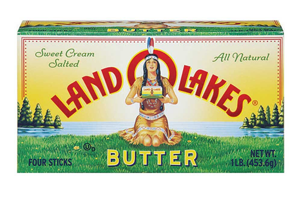
Robert DesJarlait is an artist and writer. He is from the Red Lake Ojibwe Nation in northern Minnesota. She was never a stereotype. That was my thought earlier this month when I heard that “Mia,” as the Land O’Lakes Native American maiden was known, had been taken off the butter box. She was gone, vanished, missing. I knew Mia had devolved into a stereotype in many people’s minds. But it was the stereotype some saw that bothered me. North Dakota state Rep. Ruth Buffalo (D), for instance, told the Pioneer Press in St. Paul, Minn., that the Land O’Lakes image of Mia went “hand-in-hand with human and sex trafficking of our women and girls … by depicting Native women as sex objects.” Others similarly welcomed the company’s removal of the “butter maiden” was long overdue. How did Mia go from being a demur Native American woman on a lakeshore to a sex object tied to the trafficking of native women? I know the meaning of stereotypes. I participated in protests against mascots and logos using American Indian images in the early 1990s, including outside the Metrodome in Minneapolis when Washington’s team played the Buffalo Bills in the 1992 Super Bowl. In 1993, I wrote a booklet for the Anoka-Hennepin Indian Education Program about these stereotypes. Mia was originally created for Land O’Lakes packaging in 1928. In 1939, she was redesigned as a native maiden kneeling in a farm field holding a butter box. In 1954, my father, Patrick DesJarlait, redesigned the image again. My father had been interested in art since boyhood, when he drew images related to his Ojibwe culture. After leaving Pipestone boarding school in Minnesota in 1942, he joined the Navy and was assigned to San Diego, where he worked alongside animation artists from MGM and Walt Disney producing brochures and films for the war effort. In 1946, he established himself as one of the first modernists in American Indian fine art. After I was born in 1946, my family moved from Red Lake, Minn., to Minneapolis, where my father broke racial barriers by establishing himself as an American Indian commercial artist in an art world dominated by white executives and artists. In addition to the Mia redesign, his many projects included creating the Hamm’s Beer bear. By often working with Native American imagery, he maintained a connection to his identity. I was 8 years old when I met Mia. My father often brought his work home, and Mia was one of many commercial-art images I saw him work on in his studio. With the redesign, my father made Mia’s Native American connections more specific. He changed the beadwork designs on her dress by adding floral motifs that are common in Ojibwe art. He added two points of wooded shoreline to the lake that had often been depicted in the image’s background. It was a place any Red Lake tribal citizen would recognize as the Narrows, where Lower Red Lake and Upper Red Lake meet. In my education booklet, “Rethinking Stereotypes,” I noted that communicating misinformation is an underlying function of stereotypes, including through visual images. One way that these images convey misinformation is in a passive, subliminal way that uses inaccurate depictions of tribal symbols, motifs, clothing and historical references. The other kind of stereotypical, misinforming imagery is more overt, with physical features caricatured and customs demeaned. “Through dominant language and art,” I wrote, “stereotypic imagery allows one to see, and believe, in an invented image, an invented race, based on generalizations.” I provided a number of examples. Mia wasn’t one of them. Not because she was part of my father’s legacy as a commercial artist and I didn’t want to offend him. Mia simply didn’t fit the parameters of a stereotype. Maybe that’s why many Native American women on social media have made it clear that they didn’t agree with those who viewed her as a romanticized and/or sexually objectified stereotype. Instead, Mia seems to have stirred a sense of remembrance and place, one that they found reassuring about their existence as Native American women. I don’t know why Land O’Lakes dropped Mia. In 2018, the company changed the image by cropping it to a head shot. That adjustment didn’t seem like a bow to culturally correct pressure. Perhaps her disappearance this year is about nothing more than chief executive Beth Ford’s explanation that Land O’Lakes is focusing on the company’s heritage as a farmer-owned cooperative founded in 1921. But questions remain. Mia’s vanishing has prompted a social media meme: “They Got Rid of The Indian and Kept the Land.” That isn’t too far from the truth. Mia, the stereotype that wasn’t, leaves behind a landscape voided of identity and history. For those of us who are American Indian, it’s a history that is all too familiar. Land O’ Lakes has removed the Indian woman from the cover of its butter packaging that Ojibwe artist Patrick DesJarlait reimaged in the 1950s. Note: Article originally published The Circle Newspaper on May 5, 2020 By Robert Desjarlait It wasn’t noticed until April that the Land O’ Lakes iconic image of the Indian Maiden, Mia, was missing. The disappearance of the iconic image was lost amid in the developing outbreak of coronavirus in February. It wasn’t until an article appeared in Minnesota Reformer by Max Nesterak that people took notice. The news of Mia’s demise appeared in national news including the New York Times, New York Post, Star Tribune, Time Magazine, National Review, Indian Country Today among others. And with it came the controversy of the image itself – was it the elimination of a stereotype? Or was it the loss of an image that many Natives felt connected to? Suzan Harjo, a well-known Native American rights advocate, said that Patrick DesJarlait’s “stereotype of an ‘Indian’ woman is not illustrative or even in the vicinity of his good work.” Harjo’s dismissal of DesJarlait’s skill as a commercial artist overlooks the civil rights barriers he overcame to establish himself in an art world dominated by white advertising executives and artists. Fresh out of Pipestone Boarding School in Minnesota, he joined the Navy in 1942 and was stationed at the Poston, also called the Colorado River War Location Center, for Japanese internees. He organized a sign and art department as a source of recreation for internees. He was then transferred to San Diego where he worked in the Naval Visual Aids Department producing brochures and promotional films. He worked alongside animation artists from Walt Disney and MGM studios. In the evenings and weekends, he honed his skills as a fine artist. After he returned home with an honorable discharge, he moved to the Twin Cities. He worked as a staff artist at Reid H. Ray Films which, at that time, was the oldest commercial motion picture company in the U.S. He worked at several Twin Cities film companies and advertising agencies including Campbell-Mithun Advertising, where he created the Hamm’s Bear, animated Smokey the Bear, and was part of the creation process for the Minnegasco maiden, the Firebird for Standard Gas, and Mia, the Land O’Lakes maiden. Mia was created in 1928 by Brown & Bigelow illustrator Arthur C. Hanson. She was depicted kneeling, in profile, on a wooded lakeshore. In 1939, artist Jess Betlach changed her position to kneeling toward the viewer, holding the butter box, on a farm field with cows and a lake in the distance. In the 1950s, DesJarlait reimaged Mia. He made her features softer and added Ojibwe floral motifs to her regalia. He eliminated the farm field and put a lake behind her with two forested points of land. Anyone who is familiar with his art would recognize the Narrows at Ponemah where Lower Red Lake and Upper Red Lake meet. It was a motif he used often in his paintings. He placed Mia’s head within the “O” of the brand name, lending an iconographic image to subliminally enhance the beauty of Native womanhood. But his iconic imagery became lost and forgotten in the era of political correctness. Antimascot advocates applauded her disappearance from the label. According to North Dakota Rep. Ruth Buffalo, the Land O’ Lakes maiden went “hand-in-hand with human and sex trafficking of our women and girls….it’s a good thing for the company to remove the image.” But some saw it differently. Dan McLaughlin (National Review) said, “Color me skeptical that butter labels have any effect on sex trafficking.” McLaughlin added, “The new packaging no longer has any Native American connection, and erases the work of a Native American illustrator.” Govinda Budrow is on the faculty of Fond du Lac Tribal and Community College in Cloquet. She says different generations have different relationships with the image. “I know from my mother’s generation especially, it represented basically the only representation that she had. It was the one thing that smiled back at them to say, hey, other people exist like you and they are out there.” Budrow said that in disappearing without a trace, and with no one talking about it, Mia has become more like a contemporary Native woman than ever before. “It just seemed way too ironic when I was thinking about this, about how things happen to indigenous women even now today, where women are being trafficked, they’re being oversexualized, they’re not being heard within spaces, are not being seen within spaces. And then they go missing and there’s nothing being said about them.” Budrow’s comments reflect the general trend on Facebook in which a majority of respondents, the majority of whom are Native women, posted stories about Mia that supported her existence. Indeed, for many, Mia provided them with a visual, tangible connection to their identities as Native women. In today’s politically correct world, Mia devolved into a demeaning stereotype. With her absence, the northern landscape, with its lake and forest, is devoid of her beauty. And, like a missing woman, she will be remembered to those to whom she brought comfort and a sense of grace. Robert DesJarlait is a citizen of the Red Lake Ojibwe Nation. He is an artist and writer. His father is Patrick DesJarlait. Robert DesJarlait is a citizen of the Red Lake Ojibwe Nation. He is an artist and writer. His father is Patrick DesJarlait
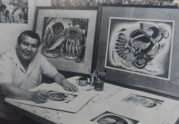
Red Lake Ojibwe artist Patrick DesJarlait circa 1971. (Photo courtesy of Robert DesJarlait) Dalton Walker
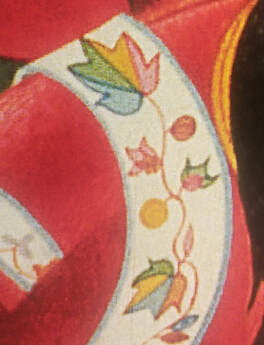
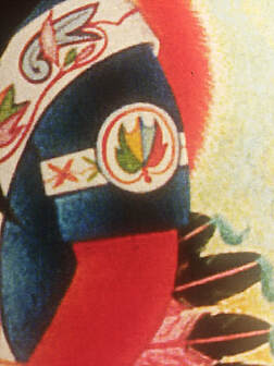
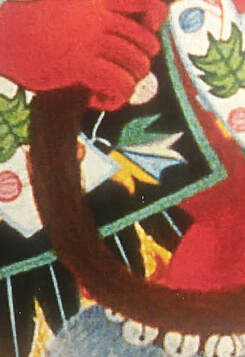
Indian Country Today There's more to this story than a box of butter. One version starts when Land O’Lakes quietly removed “Mia,” the face of its butter since 1928 from its boxes. Company president Beth Ford said in Feb. 6 news release that the new marketing campaign “needed packaging that reflects the foundation and heart of our 1/4 company culture - and nothing does that better than our farmer-owners whose milk is used to produce Land O’Lakes dairy products.” This was all done without fanfare. Where Mia kneeled for nearly a century, there is now an empty space. What remains is a logo and a lake with trees in the background. People picked up the new butter packages without much notice. Then the Minnesota Reformer, a digital nonprofit news source, reported the change on April 15. That story went viral and was posted by national media ranging from The New York Times to NBC’s Today show. The change was applauded by many in and out of Indian Country, including Minnesota Lt. Gov. Peggy Flanagan, White Earth Nation. “Thank you to Land O’Lakes for making this important and needed change,” Flanagan tweeted. “Native people are not mascots or logos. We are very much still here.” North Dakota state Rep. Ruth Buffalo, Mandan, Hidatsa and Arikara Nation, told a Fargo Forum reporter that the image goes “hand-in-hand with human and sex trafficking of our women and girls … by depicting Native women as sex objects.” A week later Rep. Buffalo added on Facebook: “It is unfortunate the issue of Land O’ Lakes cooperative’s recent decision to phase out the ‘Mia the butter maiden’ logo on its packaging has been used in a divisive way. As an elected legislator in North Dakota and a Native American woman, I was asked for an opinion on this decision that was, as with most complex issues, distilled to a short quote.” Buffalo’s well-reasoned post explored issues ranging from using Native images in the multibillion advertising issue to the impact on popular culture. “We are not invisible people, and we no longer accept breadcrumbs or in this instance, butter for those breadcrumbs,” she concluded. “Let’s work together to make real, contemporary Native American women visible and value their work and contributions to today’s society. Let’s respect and value their voices even when we may disagree.” This is where the story twists because the legacy of Ojibwe artist Patrick DesJarlait goes well beyond Mia and Land O’Lakes. DesJarlait was employed by the advertising agency Campbell-Mithun in Minneapolis when he was given the assignment to market the farmer-owned cooperative. The original brand of “Mia” had been refurbished twice since its launch in 1928. DesJarlait was tapped to create a third version. He reimagined a more human character, adding detail to Mia’s face and floral motifs on her dress. Subtle changes that mattered. That was the brand that stuck for seven decades. But the real legacy of DesJarlait is his body of work, some 300 pieces of art across the U.S. in museums and private collections. For many, especially for Red Lake Ojibwe in Minnesota, DesJarlait’s artistry impact remains nearly 50 years after his death. The award-winning artist and U.S. Navy veteran died at age 51 in 1972 from cancer complications. “My dad’s artwork has been out there for so long, and there's so many people that just don’t even know about his beautiful artwork,” DesJarlait’s daughter Charmaine Branchaud said. “There’s a story behind that man. It’s a part of history. Now, we are making history again with Mia. She’s disappeared, but that doesn’t mean my dad’s artwork is going to disappear. She was just a little bitty part of it. He had a lot of accomplishments in his life.” DesJarlait’s son, Robert DesJarlait, 73, said he was initially glad that the stereotypical image was finally removed. Then, the power of social media reminded him of another side of the discussion that was overlooked. On his Facebook page, Robert said many Ojibwe people shared their perspective of Mia while growing up Native. “Basically, it was giving the previous generation a sense of almost empowerment to see a Native woman on a box of butter. It gave them a sense of cultural pride,” he said. “After seeing those posts, I said, ‘that’s right, that’s why my dad created this image to begin with’.” The design, besides Mia, shows a lake with two points of land that Robert DesJarlait said represented Red Lake and an area on the reservation known as the Narrows, where lower and upper Red Lake meet. Another homage, one that is hard to see on the products, on Mia’s dress are Ojibwe floral design patterns. My father was working it both ways - he was strengthening the Land O’Lakes name by placing Mia at the lake and he was integrating a deeper Ojibwe connection to the environment in which they lived. Trees and lakes are part of our identity. As such, his art, and Mia, was a visual reminder of our connection to our homelands,” Robert DesJarlait said in a Facebook post. Robert DesJarlait, who like his dad is an artist, said his father has never gotten the proper credit for his creations. In the early 1950s, Patrick DesJarlait created the bear mascot, Hamm’s Bear, that was a staple for Theodore Hamm’s Brewing Company for years. “He was breaking barriers when he was in commercial art,” Robert DesJarlait said about his dad. “When other Ojibwe people in Minnesota found out (about his success) as a Ojibwe artist, they were proud of that, too.” An autobiography by Patrick DesJarlait, along with author Neva Williams, was published in 1994. The book is about DesJarlait’s life growing up in Red Lake, his military career and his life as an artist. When he was a young boy, Branchaud said her dad went blind for about a year and traditional medicines by his mom slowly helped DesJarlait regain his vision. Learning that history about her dad and her grandmother, Branchaud went into a career in healthcare. In the Navy, DesJarlait’s art talent was utilized. First as an instructor in Arizona at the Poston Internment Camp for Japanese internees and later at the U.S. Naval Academy in San Diego where he created animated training films. Prints of DesJarlait’s art work are still available online via a website Branchaud helps manage. Branchaud, 65, remembers growing up and seeing her dad working on his craft at the table in their suburban Minneapolis home. “He was at the kitchen table, doing his tracing, then watercolors came out and voilà a beautiful painting in front of him,” Branchaud said. “Those are the kind of memories I have.” Over the April 18 weekend, Branchaud went grocery shopping and hit the dairy section and purposely looked for Land O’Lakes items. She found an unsalted whipped butter tub that still has Mia. She didn’t have much luck finding any signature items with the image. “No real butter, no butter, butter,” she said with a laugh. Dalton Walker, Red Lake Anishinaabe, is a national correspondent at Indian Country Today. Follow him on Twitter - @daltonwalker Note: Originally published at Anishinaabe Perspectives on 2/28/2019 A few weeks ago, I was looking at my father’s art for an art project I’m working on and I was referencing the floral motifs he used in his work that focused on dancers. One particular work that caught my attention was War Dancers from 1964. I think when you look at his oeuvre of powwow dancers - War Dancers, The Chippewa Dancers (1968), The Chippewa Hoop Dancer (1968), Chippewa Dancer (1964) – the observer has a tendency to see the overall images and miss some of the finer detail in the regalia that the dancers are wearing. One is aware of the floral motifs but the eye wanders over them and doesn’t really connect with the detail. It’s understandable since an observer is taken in by the rich array of colors of his work. Indeed, the color arrangements are unlike men’s dance regalia from the 1960s. What the observer sees is a rich palette of colors that forms the aesthetic of a modern Native American artist. And the results are colors that form and shape the regalia in brilliant hues. In retrospect, his colors are something of a paradox, at least a paradox at the time the dancers were painted. Consider War Dancers. In this work, we see eagle feather bustles that are pink, green, and yellow-gold; green and yellow-gold eagle fans; and yellow, pink, and blue anklets which, at that time, were commonly white or red. Even in the roaches that, in the 60s, were red, we see an array of colors – reddish-brown, blue, brownish-gold. And then there are the floral motifs. One might assume that he simply painted the floral designs that he saw at powwows, and that he used books that featured floral designs. However, he couldn’t really access books since books with floral designs weren’t available in the 60s. So, he had to rely on what he observed at powwows. Obviously, he had a sharp memory given the floral motifs in his work. However, he was making his own floral designs based on the images that were stored in his memory. He was like a bandolier bag maker from the late 1800s and used paint instead of beads to make his arrangements. He had to adapt floral forms to paint in the same way that bandolier beaders adapted beads from the traditional form of quills. In this way, he wasn’t simply copying floral designs – he was creating his own floral forms. One particular floral motif that caught my eye in War Dancers is a leaf divided into four colors that are separated by the vein in the leaf. It reminded me of a bandolier bag that features red and blue leaves. Those red and blue leaves have always mystified me. They are such a departure from bandolier color aesthetics. How and why did the bandolier bag artist make such a departure? We know leaves aren’t a deep, solid red or blue. But this particular artist decided that they can be red or blue. Those red and blue leaves go beyond the norm of color used then and represent a step into modernism – at a time when modernism was unknown to Ojibwe bandolier artists. In that sense, modernism is the next logical step in art. This particular bandolier artist was expressing modernism in terms of color. Most interestingly, those leaves strongly connect to Fauvism although, as noted, such art was unknown to Ojibwe artists. My father’s four-colored leaf offers yet another parallel in terms of color aesthetics. In his palette, we see an array of leaf colors – blue, red, gold. But the four-colored leaf is a departure. In this particular leaf, we see four colors – light blue, light green, yellow, and pink – divided by the vein. A variation of the leaf on a dancers’ armband rearranges the colors to green, yellow, light blue, and red. There are also leaf variations on the dance aprons including one with green, white, blue, and yellow. Unlike the bandolier artist who didn’t have exposure to modern art, my father did. He was familiar with Mexican muralism, Cubism, and Fauvism. And he is, of course, considered the first Native American modernist artist. Yet, the four-colored leaf represents something different. Like the red and blue bandolier leaves, the four-colored leaf also intrigues me. It seems like a logical step for him to take, but what a step it was to go beyond the norm and create something new. In hindsight, I like to think that my father was something of a visionary in regard to regalia color. At a time when these colors were virtually unknown in regalia, they have become common today. I’m not suggesting that he had any influence on today’s colors. In the powwow world, the vast array of brilliant, beautiful colors was the next logical step into the modern powwow. The four-colored leaf, painted fifty-five years ago, was a vision of what was to come. Detail - Armband, "War Dancers," ca. 1964 Detail - Dance Apron, "War Dancers," ca. 1964 © 2019, Robert DesJarlait
|
AuthorRobert DesJarlait Archives
September 2023
Categories |
 RSS Feed